Quantcast
Channel: Paul Shapiro, Author at MarTech
Viewing all 24 articles
Browse latest View live

How to Leverage Social Media for SEO: Link Building

$
0
0

breaking down the silos of SEO and Social Media Marketing with Link Building

I recently asked a room of experienced marketers how they thought social media marketing could assist their SEO efforts. The answers were more or less what I had expected to hear:

  • Social media helps foster relationships, which in turn helps build links and improves rankings.
  • Social media aids in public relations, as a distribution channel and a means of generating easy online buzz.
  • Social sharing provides a form of social proof, giving greater credibility and trustworthiness to your content.
  • Brands can rank for their social networking profiles and receive greater visibility within the SERP.

While these are all true, let’s focus on how link building on social platforms can help unite a brand’s social media marketing and SEO efforts.

At the most basic level, social networking sites provide an easy way to share and distribute your message. If the content is seen by the right people, it can lead to new backlinks.

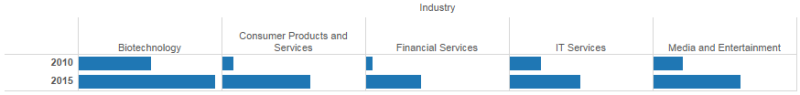
In fact, there are measurable correlations between social shares and backlinks that demonstrate that social media can help with backlink acquisition. Let’s explore this integration across social platforms.

Link Building with Google+

Google+ has an excellent infrastructure for finding link opportunities and organizing those linking prospects for outreach; it even includes an integrated messaging system for actually getting in touch with these people.

Prospecting

There are lots of ways to find linking opportunities on Google+. For example, using Google search, you can find a journalist by publication with an advanced search operator such as site:plus.google.com inurl:about “contributor to” mashable.com

Alternatively, you can use the “find people” section on Google+ and search with the “find coworkers” function. In the “company name” field, insert the name of a publication.

Using Google+ for Link Prospecting

Organizing Link Building

You can use Google+ Circles to organize and segment outreach lists.

I typically have a Circle for journalists by publication, a Circle for prospects who wrote about similar subject matter, and a Circle for bloggers with whom I have had past successes building links.

After you have gotten a link from someone, you can move these individuals into a “Success” Circle.

Using Google+ Circles to Organize Linking Outreach

Reaching Out Within Google+

One of the great advantages of doing link building with Google+ is its versatile built-in outreach engine.

Once you have an outreach Circle, you can choose to share an update specifically with the individuals contained in that Circle.

If people in the Circle have circled you back, then you can also opt to send them an email notification with that update. Check the “Also send email from you to [Circle Name]” box, and they will receive the update in their inbox.

promoting links to google plus circles and sending them an email

You can also send a message to individuals or even initiate a Hangout with them (message or video). This is a great substitute for emailing.

making using of Google Hangouts for link building

Link Building with Twitter

Twitter is my social network of choice, and it also is a powerful channel for your link-building efforts.

Tools like klear (formally Twtrland) or Followerwonk can be leveraged to easily find subject matter influencers and their associated websites.

Using Followerwonk for link prospecting on Twitter

Once you know your prospects, you can organize them using Twitter Lists. You can easily import them using a tool like Electoral. Segment your lists and interact with the people periodically, building relationships with them over time.

If you are looking for a Twitter user’s email address, you can use a tool like All My Tweets to load everything they’ve ever tweeted on one page — then use Control +F in your browser to look for patterns that resemble email addresses like “at domain dot com.”

If you cannot find someone’s email address, Twitter Direct Messages are a decent substitute and can provide a more private option, as compared to just mentioning people with linking inquiries. Of course, they have to be following you before you’re able to send them a direct message.

You should also be doing some basic social listening on Twitter (and other social networks) using a tool like Social Searcher.

Keep a lookout for people who mention topics related to your website’s niche that you might be able to ask for a link. The old “I see you mentioned [topic], so you might like [link]” works quite well.

Link Building with YouTube

People love to link to video content, but, unfortunately, most companies depend on YouTube for their entire online video strategy.

The result of this mindset is that YouTube.com earns all the backlinks for your video content rather than your company’s website. Your company can mitigate this by self-hosting videos or using a service like Wistia, which allows you to control embedding so that people link to your website instead of to YouTube.

If self-hosting videos is not an option, and your company insists on an all-YouTube-or-nothing approach, you can still use that video content to build links through a standard link reclamation process:

Take a video that has been successful on YouTube, put the YouTube.com URL into a backlink checker like Majestic, Ahrefs, or Moz’s Open Site Explorer and get a list of websites linking to it.

You can reach out to these websites and ask them to link to your company website instead of the YouTube.com link.

Another approach is to access your company’s YouTube Analytics. “Traffic Sources” will show you any websites that embedded the video (but not necessarily linked to it). You can reach out to those websites and request a link to your company website.

Using YouTube for link reclamation

Link Building with Social Paid Search

Half the battle of link building is getting in front of the right eyes, and paid social ads can help!

For example, you can use Facebook ads and target people by their workplace. For our purposes, we’d target journalists (who may link to us), and the workplaces would be a list of publications like Wired, The New York Times, and Mashable.

You can use LinkedIn advertising to accomplish this, but those ads tend to be a little more expensive.

Using Facebook Ads for link building and targeting journalists

Conclusion

As you can see, there are many ways to perform link building using social media. It is one of the many ways to break down marketing silos and integrate your social media marketing and SEO.

Social networking has become one of the primary ways we communicate today, so those platforms become a logical medium for conducting link outreach. In addition, there are tools baked into social network sites to aid link prospecting, easy ways to get in front of influential journalists who may have otherwise ignored you, and even systems to help organize your outreach.

Social media and SEO are two peas in a pod, and building links is a great way to make use of their synergy today.


Creating Synergy Between Social Media And Search

$
0
0

Social media image copyright rvlsoft

In my last exploration of leveraging social media for SEO, I discussed how one can utilize social networks for link-building purposes. However, link building is only one of many ways that social media marketing and search can fuel one another.

Let’s explore some other social-search synergies.

Keyword Data

Social media can provide a rich secondary source of keyword information. The language used on social networks tends to be very conversational, and studying it is particularly useful for finding fresh, emerging keywords and naturally formed key phrases that might otherwise have remained hidden using conventional keyword research techniques.

At BrightonSEO in April, I discussed a free data-mining system for keyword research using the Twitter API. If this is a little too technical for you, there are some other, simpler ways of drilling into this data.

visualizing Twitter keywords for keyword research purposes

With a user-friendly tool like Foller.me, you can input your company and competitor Twitter usernames and get a list of “Twitter Topics” that are most prevalent in your space. These keywords should usually have representation on your website.

using foller.me to extract keyword topic from twitter to help with SEO

Another option for Twitter data is Hootsuite’s free Hootlet browser extension. One of its many features is a sidebar that appears alongside searches in the SERP that displays related tweets.

It’s helpful for finding topical gems and extra keywords as you explore information about a website’s subject matter or while performing keyword research-driven searches.

Hootlet adds Twitter results to the SERP

Optimization And Testing

Writing meta descriptions (or page titles) can be challenging, and often we do not have an opportunity to test their effect on CTR (click-through rate) beforehand. Using paid search to verify meta descriptions as ad copy requires a hefty budget. Fortunately, organic social media posts are free and are a viable testing alternative.

Meta descriptions tend to truncate around 155 characters, and tweets have a limit of 140 characters. Although not perfect, you can send a tweet with meta description copy, trying different variations and checking engagement metrics via Twitter Analytics.

The more engagement you get for a variation, the better the copy is for a meta description.

Alternatively, if you feel suppressed by Twitter’s character limit, you could do the same thing with Facebook, and then look at the number of likes the different post variations accrue.

You can do the same thing with title tags, or you can go the extra mile and conduct a more formal survey. I have used polling services like Wedgies, which embeds seamlessly into Twitter, making your post more interactive.

There is also an awesome service called TitleTester that is designed for this exact purpose. Although it doesn’t provide a poll that you can interact with right in the Twitter stream, it does have some advantages.

For one, TitleTester allows you to randomize the titles you are testing to yield more accurate and less biased results. For a nominal fee, you can even solicit additional people for the survey.

using TitleTester to write meta titles

Content Ideation

Social media — especially discussion-based networks — provides an excellent resource for new content ideas.

You can use this Google Spreadsheet to keep an eye on frequently asked questions in relation to your website’s topic on Quora (h/t John Doherty). To use the spreadsheet, choose “File->Make a copy…” and then change the column headers to a relevant topic on Quora.

example of tracking questions for content marketing purposes with Quora and Google Spreadsheets

Similarly, you can examine the types of questions people are asking on community websites like Reddit via FAQFox.

To use it, type in a relevant keyword and enter a website you want it to scrape; you can also select a category to look at pre-defined niche communities and social networks. You’ll get a list of questions people are asking, which you can then to export to CSV.

using FAQFox for content ideation and SEO

If you want to give your content a higher chance of performing well, being shared and linked to, then head over to BuzzSumo to look at existing material that has a proven track record of success.

Type a relevant keyword, examine the most shared content about that keyword, and expand upon it, making it better. It’s an easy way to strike content gold.

using BuzzSumo for SEO content ideation

Facebook Search Graph

Since being introduced in January of 2013, Facebook Search Graph has become increasingly more robust, and its features provide a wealth of useful information for search marketers.

SEO consultant David Mihm recently gave an excellent talk about Facebook Graph Search at MozCon, with some very practical use cases. Here are a few highlights:

  • To find a website to invest in for the Google Display Network, you can search Facebook for “Pages liked by people who like [insert Facebook page of relevant publication].”
  • To find influencers to get your message out there, you can search Facebook for “Journalists who live in [your location] that like [insert interest].”
  • To help build out personas and know what to write about for your audience, you can search “interests liked by people who like [insert your Facebook page].”

In With Search, Out With Facebook Ads Retargeting

My colleague, Nicholas Vining, has had success driving traffic and awareness through both organic and paid search, then remarketing to users on Facebook using a Custom Audience pixel. Here’s how:

Generate a tracking code and apply it to the head of your website. Then create one or more audiences, each with its own Audience Rules. For example, you can target all the people who came to your site via AdWords by inputting your paid search-specific landing pages under the “Website Traffic” section.

When someone clicks on your ad on Google, you can serve them an ad the next time they are on Facebook. This produces an additional opportunity to convert them if they did not do so the first time via AdWords.

targeting PPC landing pages with Facebook

Google Trends: Real Time For Social Sharing

With recent changes to Google Trends that allow us to see hourly activity, we now have a clear way for search data to inform our social media marketing.

For example, if I am promoting a sleep aid product, I can go to Google Trends and look at the term Nightmare. Looking at a seven-day view, we see that searches for Nightmare typically peak between 2:30 a.m. and 3:30 a.m. ET.

We can conclude from this that we should schedule posts about our product on Twitter and Facebook around this time to reach our target audience when they are seeking information.

using hourly Google trends for social post scheduling

Final Thoughts

There are many ways social media activity and analytics can inform your SEO and PPC efforts. Think about your own internet usage patterns: you’ll likely see that most of your time is spent either searching for something or using social networks.

It’s time we stop treating search and social as separate marketing channels operating in silos and start investigating ways they can work together for smarter, more unified marketing.

Four Tools To Break You Out Of The Keyword Research Box

$
0
0

data-information-overload-ss-1920

Keyword research is a fundamental activity for an SEO professional, and although everyone does it a little bit differently, there are a few typical steps most people employ:

  1. Come up with a list of base keywords that will be used to come up with more ideas.
  2. Expand upon your base keywords using autosuggest and/or other means.
  3. Find search volume, competition and/or prioritize your list of keywords.

This post will tackle some little-known, alternative ways to accomplish steps 1 and 2, to come up with a greater number of keyword ideas without relying purely on brainstorming or the Google Keyword Planner.

[Read the full article on Search Engine Land.]

How To Get Started With Accelerated Mobile Pages (AMP)

$
0
0

google-amp-speed-race-fast-ss-1920
Google’s AMP was launched yesterday. Are you ready for it? In today’s column, I’ll give you an overview of the offering and show you how to get started with it.

What Is AMP?

This past October, Google announced Accelerated Mobile Pages (AMP), a very accessible framework for creating fast-loading mobile web pages. The open-source initiative is designed to enable publishers to easily improve speed (and consequently, the user experience) for their mobile readership without sacrificing any ad revenue that they may rely upon.

Although experienced developers can often achieve similar results through intensive performance optimizations, publishers often neglect this due to resource constraints. AMP allows these optimizations to be easily achieved without altering the primary mobile web experience.

There’s also the added benefit of its future usage by Google and other prominent web technology companies, who are encouraging its use by integrating it heavily into their respective platforms.

Continue reading on Search Engine Land for an explanation of how AMP works as well as detailed instructions on how to implement it on your site.

[Read the full article on Search Engine Land.]

The essential metrics to analyze for keyword research success

$
0
0
keywords-ss-1920

Brainstorming keyword ideas is great, but you won’t get very far if you’re not looking at the right metrics. After all, it’s the metrics — the objective criteria we use to make the data-driven decisions — that make search such an effective marketing channel.

But which keyword research metrics should I be considering? Isn’t search volume sufficient? Let’s explore.

Search volume

Average monthly search volume is the one metric that is universally used for keyword research. This metric is derived from Google’s Keyword Planner, a free tool intended for use with AdWords, and it forms a foundation for the popularity of a given search query.

Typically, one chooses the exact match type for a more precise representation of search volume for a keyword. If your business is regionally locked, make sure to specify a geography to get regional search volume.

Recently, Russ Jones wrote an excellent article on Moz discussing some of the issues with relying on Keyword Planner search volume. Jones found that search volume numbers are actually rounded to the closest of 85 “buckets” and that the 12-month average is also rounded to one of those traffic buckets. To get a more accurate 12-month average, one must segment monthly search volumes and manually average them.

Jones also found that the Keyword Planner doesn’t combine the search volumes of keyword phrases that are auto-corrected to a shared search engine results page (SERP).

russ-kw-planner

To get more out of the search volume metric:

  • Choose the exact match type.
  • If your site is geographically dependent, choose the appropriate region.
  • Manually average the last 12 months of search volumes, rather than relying on Google’s provided 12-month average.
  • Group volumes of keyword variants together.

Search volume over time

Another important keyword research metric that is often ignored is how search volume changes over time. Depending on your budget, it may not make sense to invest in content creation for a keyword that won’t capture traffic in a year.

To make this data more useful for decision-making, one would calculate a 12-month average search volume from one year to another, then boil it down to a single positive or negative number using the slope formula.

[Read the full article on Search Engine Land.]

Improve internal linking for SEO: Calculate Internal PageRank

$
0
0
pins-links-ss-1920

Your site architecture — the way you structure and organize internal links (e.g., a link to the About Us section of your website from your main navigation) — plays a vital role in how both users and search engines are able to navigate your website, ultimately impacting your website’s rankings.

Modern search engines use links to crawl the web. The crawlers used by these search engines click on each link that appears on a page — both internal links and external links — and then all the links on each subsequent page, and so on. This allows the search engines to find your pages and rank them in their indices.

Search engines such as Google also use the number of links to rank query results, considering each link as a vote of importance for a page (i.e., PageRank).

For this reason, the way you link the pages on your website plays a big role in how search engines crawl, understand and rank your site. As an SEO practitioner, how do you make sure your site architecture is optimal and that internal links are organized correctly? Let’s explore how calculating a metric I call Internal PageRank can help us with this task.

Basic site architecture and navigation-based internal links

There are two basic types of internal links:

  1. The internal links that form your site’s navigational structure
  2. The secondary internal links that appear in context throughout your site (in articles and other places that aren’t necessarily a product of your site’s navigational structure)

Let’s look at the former. The first step to getting your internal links in order is to organize common navigation elements and adhere to a well-organized site structure. I recommend creating a classic internal linking structure and utilizing Bruce Clay’s silo architecture as a foundation for internal links. These are tried and tested, logical site structures that work.

Now that your site has a solid foundation for internal links, let’s take a look at how these navigational links, as well as the internal links that exist in context, might impact how the search engines crawl and rank your pages. To look at the overall internal linking impact, we will examine the internal PageRank of all the pages.

[Read the full article on Search Engine Land.]

A brief introduction to data visualization theory for marketers

$
0
0
business-analysis-charts-data-ss-1920

I’ve been thinking a lot about data visualization lately and how it applies to our roles as marketers.

As marketers, it is typical for us to spend a significant amount of time working with spreadsheets and looking at, analyzing and playing with data. The final product of that data usually comes in the form of pretty charts, graphs and visualizations — and yet many marketers don’t know the principles of data visualization theory.

Let’s explore some of these principles and start making better graphs!

Why use data visualization?

Our brains are wired in such a way that we are more able to mentally process data and derive insights when it is graphed than when it is displayed in a tabular format such as in an Excel spreadsheet. As data visualization expert Alberto Cairo puts it in his book, “The Functional Art,” “[T]he first and main goal of any graphic and visualization is to be a tool for your eyes and brain to perceive what lies beyond their natural reach.”

Example #1

To demonstrate this principle, let’s look at a tangible example: a famous dataset known as Anscombe’s quartet. The data consists of four sets, labeled in Roman numerals, which each contain an x and y coordinate. In Excel, the data are very difficult to digest and to derive insight from::

tabular-anscombe

If we were to analyze these data with common summary statistics, we’d find that it looks very much the same:

anscombe-summary

At this point, there still aren’t any obvious patterns or stories that can be easily gleaned from this data. But if we graph this data using a series of scatter plots, a whole new world of insights opens up:

anscombe-graphed

Wow! When graphed, we see some differences in the data:

  • Set I: Shows a simple, straight-lined linear regression.
  • Set II: Shows a non-linear relationship between X and Y in the form of an upside down parabola.
  • Set III: Shows another straight-lined regression, but with an obvious outlier.
  • Set IV: Doesn’t show a relationship between X and Y, and there is an even more obvious outlier than seen with Set III. All but one X value are equal to the same value, 8.

Example #2

Let’s take a look at another quick example, which is a little bit more applicable to marketing. If we have some data regarding visits to our main website and our microsite segmented by gender and age, can we easily identify a trend using tabular data?

main-site-microsite-example

Nothing is obvious immediately — at least not until we decide to visualize this data. There are just too many variables to process at once.

main-micro-graphed

Using the data visualization, a story becomes apparent. On average, there are fewer males visiting both our main website and our microsite, for both age groups, with a single exception. For some reason, our microsite seems to be resonating with 25- to 29-year-old males more than females!

Now that we’ve explored the reasons why data visualization is an important component to data analysis, let’s explore some principles that enable us to describe our data more effectively.

The science behind choosing the right graph

Let’s quickly discuss how visual perception works. Here’s a simplified version of what happens when you look at something:

  1. Light is reflected off an object that you’re looking at and moves through the eyes.
  2. It filters down into the retina in the brain via its photosensitive cells (rods and cones), where it is encoded as electrical signals.
  3. Your brain now detects basic features, also known as preattentive attributes.
  4. The brain performs more analysis and encodes information within your memory (iconic memory, working memory and long-term memory).

Preattentive attributes

Let’s examine step 3 more closely. Preattentive attributes are certain visual properties which are detected almost immediately (less than 200–250 milliseconds) without effort or extra processing by the brain.

Preattentive attributes include:

  • Color
  • Length
  • Width
  • Orientation
  • Shape
  • Size
  • Enclosure
  • Hue
  • Intensity/Shade
  • Position

You can play with interactive examples here.

Although preattentive features are detected almost immediately, some of these features are more quickly detected than others. For example, we can detect variation in color more quickly than we can detect variation in shade or shape.

Let’s test this theory. If you are given a block of text consisting of different numbers (i.e., different shapes), how fast can you pull out each “5”? Give it shot. You can’t do it too quickly.

string-of-numbers

Now if we highlight all the 5s in a darker shade, we can detect them much more quickly.

string-of-numbers-black-5

We can detect them even faster than a darker shade when we make them a totally different color.

string-of-numbers-red-5

This is extremely powerful information. There are features that you can incorporate into your graphs and visualizations that basically take zero mental processing and can help improve the communication of data.

Cleveland & McGill’s research: Why choosing the right graph matters

Statisticians William S. Cleveland and Robert McGill took the concept of preattentive attributes and other research on graphical perception and conducted some of the most groundbreaking scientific research pertaining to data visualization of all time.

Cleveland and McGill developed a hierarchy of elemental perceptual tasks and ranked how accurately people were able to use them to decode data. In order of most accurately perceived to least, the tasks were as follows:

  1. Position along a common scale
  2. Position along nonaligned, identical scales
  3. Length, direction, angle
  4. Area
  5. Volume, curvature
  6. Shading, color saturation

Let’s explore how this hierarchy can help us choose a better visualization for a data set.

The data used in the examples below compare how much venture capital funding was received by various industries in 2010 versus 2015.

Concentric bubbles graph

Let’s start by visualizing the size and difference of venture capital funding by industry using concentric bubbles.

concentric-circles

Now, let’s ask ourselves some questions about this graph. I’ll give you the answers later, but try to answer them without peeking first:

  • Which industry received the greatest amount of venture capital funding in 2015?
  • Which industry received the second most amount of venture capital funding in 2015?
  • If you had to guess, what percent of funding did the Biotechnology industry receive in 2010 compared to 2015?
  • If you had to guess, what percent of funding did the Media and Entertainment industry receive in 2010 compared to 2015?

Make note of your answers and ask yourself the same question when looking at the next graph. It’s the same data represented differently. Do your answers change?

Bar Chart #1

bar-chart-1

Let’s try this exercise one more time. Again, it’s the same venture capital data, just represented in a slightly different graph.

Bar Chart #2

bar-chart-2

I suspect your answers have changed — or at the very least, you have grown more confident in them. Each iteration of this graph was improved using information from the Cleveland and McGill hierarchy and made use of perceptual tasks that you are more easily able to decode.

Here’s the last graph, Bar Chart #2, including the actual values.

bar-chart-values

Question:

Which industry received the greatest amount of venture capital funding in 2015?

Answer:

Biotechnology.

This was the easiest question to answer, since you were able to tell even when it was depicted using the concentric bubbles graph. It was however, significantly harder with the bubbles than with the different bar graphs, because the bubble graphs primarily made use of “area,” which is much harder for us to perceive than “length.” We also have a particularly difficult time perceiving the area of circles, so our perceptual task was further hindered by the graph items’ shape.

In Bar Chart #1, we were making use of “length.” But Bar Chart #2 was easier to read because it used “Position along a common scale,” allowing you to truly see how much more funding Biotechnology received than the other industries depicted in the data set.

Question:

Which industry received the second most amount of venture capital funding in 2015?

Answer:

Consumer Products and Services.

This is much more difficult to see using the concentric bubble graph. The amount of venture capital that the Consumer Products and Services industry received ($4,800 M) is very close to what the Media and Entertainment industry received ($4,749 M). Area is particularly difficult to decipher when we’re comparing multiple similar values.

Bar Chart #1 isn’t an optimal encoding of this data either. It uses “Position along nonaligned, identical scale” (second best on the Cleveland and McGill hierarchy) represented as small multiples, which isn’t as good as encoding it as “Position along a common scale” (best on the Cleveland and McGill hierarchy), as represented in Bar Chart #2.

Question:

If you had to guess, what percent of funding did the Biotechnology industry receive in 2010 compared to 2015?

Answer:

Fifty-four percent. In 2010, Biotechnology received $3,984 M in venture capital funding, whereas in 2015, it received $7,408 M in venture capital.

This is nearly impossible to identify with the Concentric Circle Graph, because of its use of Area (fourth best on the Cleveland and McGill hierarchy). Most people will incorrectly say around 80 percent.

Question:

If you had to guess, what percent of funding did the Media and Entertainment industry receive in 2010 compared to 2015?

Answer:

Thirty-four percent. In 2010, the Media and Entertainment industry received $1,624 M in venture capital funding; in 2015, it received $4,749 M in venture capital.

As with the previous example, it is very difficult to correctly identify the proportions using the concentric bubble graph. Humans are not that good at perceiving differences in area, especially of circles. Most people will incorrectly say around 50 percent.

Conclusion

Data visualization is part art, part science. There is no correct way of visualizing a single piece of data, but there are some concepts we can apply to make more effective graphs and visualizations. I’ve given an overview of some of these concepts, explaining the preattentive attributes and how to leverage to Cleveland and McGill’s perceptual hierarchy.

The next time you create a chart in Excel or craft a report or presentation, think about these concepts, and make your data visually soar.

How to check which URLs have been indexed without upsetting Google: A follow-up

$
0
0
google-questions1-ss-1920

Back in October 2016, I wrote about how you can use a Python script to determine whether a page has been indexed by Google in the SERPs. As it turns out, Google’s webmaster trends analyst Gary Illyes wasn’t too happy with the technique that was being utilized by the script, so I cannot endorse this method:

Shortly after, Sean Malseed and his team at Greenlane SEO built a similar tool based in Google Sheets (among other awesome tools like InfiniteSuggest), and Googler John Mueller expressed reservations:

How could I learn which pages weren’t indexed by Google, and do it in a way that didn’t break Google’s rules? Google doesn’t indicate whether a page has been indexed in Google Search Console, won’t let us scrape search results to get the answer and isn’t keen on indirectly getting the answer from an undocumented API. (That was Sean Malseed’s clever solution and scraping workaround.) Let’s explore some solutions.

[Read the full article on Search Engine Land.]


Google site search is on the way out. Now what?

$
0
0

Spring has sprung, and Google has started off the season with some spring cleaning of its service lineup. They’ve recently announced that Google Site Search is on the way out. Come April 1, 2017, Google will discontinue sales and new renewals of the service, and a year later, April 1, 2018, the service will be completely shut down.

So, what’s the big deal? Search is search, right? The short answer: no. The longer answer is a little more complex, but still easy enough to understand from an end user’s point of view. While not everyone utilizes website search features, those who do are looking for something specific and expect to find answers quickly and easily. If people are on your website and using the search feature, they are obviously interested in what you have to say or in what you’re selling, so catering to them is important. If your search function is weak, users may leave your site, meaning you’re losing a fan, a lead and a customer — and in 2017, that is simply unacceptable.

Google Site Search was an easy-to-implement, safe bet that provided Google-level search within your website. Website owners knew what they were getting, and users felt comfortable using the feature. Now what?

Before you start scrambling to find a suitable replacement, let’s talk a bit about what led us to this point and where you can feasibly go from here. What are current customers losing, and what other options are available for website search functions?  Trust us, it’s not as bad as it seems.

[Read the full article on Search Engine Land.]

Building an Amazon Alexa Skill is so easy, Grandma can do it

$
0
0
Amazon devices with the Alexa agent.

Amazon devices with the Alexa agent

Last holiday season, the Amazon Echo was at the top of everyone’s wish list. Amazon sold a lot more than they had expected, and they had difficulty keeping the product in stock. Estimates place the number of devices sold at over 9 million, about nine times what they sold the year before!

And this year’s Prime Day yielded similar, impressive success. With those kinds of numbers, as marketers, we really ought to be thinking about ways to capitalize on that momentum. One way is by building our own Amazon Alexa apps, known as “Skills.”

When I first got my Echo, I was excited to start programming my first Alexa Skill. I soon came to realize that although you can certainly build some awesome, more advanced skills with some programming chops, it isn’t necessary to write a single line of code if you just want to get your feet wet with Alexa Skill creation. It was so easy to make my first Skill, in fact, that I’m fairly certain my not-so-technically-savvy grandma could do it.

Oh, and here’s an SNL skit about Grandmas and Alexa.

Before we get into how to create our first codeless Skill, let’s briefly examine the different types of Alexa Skills you can create:

Types of skills

There are four main types of Alexa Skills:

  1. Custom Skills
  2. Video Skills
  3. Smart Home Skills
  4. Flash Briefing Skills

Custom Skills

The Custom Skill type is probably what comes to mind first when you think of an Alexa Skill. The sky is the limit when it comes to the Custom Skills type. As the name implies, it allows for a custom interaction model, enabling some of the more robust Skills like Jeopardy and Domino’s. This Skill type requires programming expertise. But the documentation is pretty robust, and there are plenty of code examples to reference in the wild or via Amazon.

Video Skills

Video Skills are a recent addition to the type of Skills you can develop. It focuses on control of video. In Amazon’s words, “Video skills target content and video services, which can include changing the channel, but also enables customers to search for content and choose content to play from search results.” So, you wouldn’t use this Skill type to raise the volume on your WiFi-enabled TV. If your intention is to interact with a video device, it will be easier to use the video API than to build a fully custom Skill.

Smart Home Skills

Smart Home Skills are for controlling connected home and home automation devices such as the Nest or Phillips Hue light bulbs. If your goal is to control these type of devices, it’s easier to leverage this Skill type, due to an associated API, rather than creating a fully custom Skill.

Flash Briefing Skills

Lastly, there is the Flash Briefing Skill type, the one we will be discussing.

A common activity for Amazon Echo device owners is asking Alexa about the news. Users are able to assign different news sources to be included, and news items are read out upon asking Alexa, “What’s my Flash Briefing?” or “What’s in the news?”

If you’re a publisher, it’s an absolute no-brainer to set up your own Flash Briefing Skill. It’s also very easy to set up this type of Skill, as it requires zero programming. Let’s explore how to do this.

Creating your Flash Briefing Skill

Awesome. You’re ready to create a Flash Briefing Skill. The first thing you need to do is set up an Amazon Developer account:

https://developer.amazon.com/

Once you’ve set up your Developer account, sign in and select the Alexa tab at the top of the Developer Console:

Click the “Get Started” button nested under “Alexa Skills Kit”:

Now, choose the “Add a New Skill” on the right side of the screen.

Choose “Flash Briefing Skill AP” for Skill Type, choose a language, and give it a name:

Hit “Next” until you reach the Configuration Stage.

Set an error message in case something goes wrong.

Mine is set to “Uh oh. The Search Wilderness skill got broke-ed broke-ed broke-ed.

Click the “Listen” button to ensure that Alexa will read your error message correctly.

Then, click the “Add new feed” button:

Add a preamble. For mine, the field is set to “From the Search Wilderness blog.

Give your feed a name. Mine is “The Search Wilderness Blog.

Set your content update frequency. Mine is set to daily, since I don’t update my blog that frequently. A publisher like Marketing Land that publishes articles multiple times per day would probably want to set this to hourly.

Choose your content type as “text” — although you can choose “audio” and opt to record mini-podcast audio files that it would play instead.

Select the most appropriate content genre. Mine is set to “other.”

Your feed

Now for URL, set the destination to your blog feed. You might be inclined to simply input your blog’s existing RSS feed for this. This process is easy, but unfortunately, it’s not that easy.

You need to ensure that the content on the RSS feed is (a) short enough for a quick news update, and (b) 100 percent pronounceable by Alexa.

[Read the full article on MarTech Today.

Optimizing for Hanukkah: Sometimes it’s still strings, not things

$
0
0

My wife came to me with a problem. She wanted festive, whimsical, and potentially matching Hanukkah pajamas. But there weren’t enough options coming up in Google under one spelling of the holiday’s name, so she told me she was systematically going through all spellings to compile her list of shopping items.

I was pretty surprised by this — I had expected Google to be smart enough to recognize that these were alternative spellings of the same thing, especially post-Hummingbird. Clearly, this was not the case.

Some background for those who don’t know: Hanukkah is actually a transliterated word from Hebrew. Since Hebrew has its own alphabet, there are numerous spellings that one can use to reference it: Hanukkah, Chanukah, and Channukah are all acceptable spellings of the same holiday.

So, when someone searches for “Hanukkah pajamas” or “Chanukah pajamas,” Google really should be smart enough to understand that they are different spellings of the same concept and provide nearly identical results. But Google does not! I imagine this happens for other holidays and names from other cultures, and I’d be curious to know if other readers experience the same problem with those.

[Read the full article on Search Engine Land.]

Reducing the time it takes to write meta descriptions for large websites

$
0
0

Sometimes improving a website’s presence via search engine optimization (SEO) is very straightforward, and sometimes it’s not.

In the case of large websites, basic SEO improvements can be a massive headache. If you’ve ever optimized a large website, you know they can be prone to a myriad of SEO issues that tend to fall into one of two buckets, traditional technical SEO or issues of scale.

We could spend a lot of time talking about each, but for this article, I’d like to touch on a solution for a particular issue of scale: having to retroactively write a lot of web page meta descriptions.

I know, it’s not a sexy-sounding topic, but meta descriptions are extremely important for SEO. Along with title tags, they represent our own version of ad copy, especially since they don’t really impact query-result relevance. As long as Google doesn’t obliviate that small snippet of text, it represents our chance to capture searcher intention and influence click-through rate.

In an ideal world, the SEO practitioner in charge would act as a copywriter. Having a strong understanding of the business, audience and search intent, they would manually craft optimal, persuasive text. For small websites, this is very feasible. For larger websites with thousands of pages, this becomes an impossibility. In all likelihood, even a big business will never have enough resources to change each meta description by hand.

So what’s an SEO to do? Is the only solution to hire more writers?

Typical solutions

For some websites, especially websites where many of these pages follow the same page template, it may make sense to use the same logic and utilize templated meta descriptions as well.

Of course, this is dependent on database structure, content management system (CMS) restrictions and development resources, but it is still an excellent solution if feasible.

Have an e-commerce website with a lot of product pages? Try something along the lines of:

Buy {product name} from Store Name today. {short product description}

Is this an ideal description? Probably not, but it’s better than letting Google automatically insert random and irrelevant paragraphs of text or footer links they perceive as representative.

Is templating not an option for your company? The reality is, if you don’t provide a meta description, Google will do the heavy lifting and show a snippet anyway. Sometimes you even write a custom meta description, and Google rewrites them a…

[Read the full article on Search Engine Land.]

The post Reducing the time it takes to write meta descriptions for large websites appeared first on Marketing Land.

Building an Amazon Alexa Skill is so easy, Grandma can do it

$
0
0
Amazon devices with the Alexa agent.

Amazon devices with the Alexa agent

Last holiday season, the Amazon Echo was at the top of everyone’s wish list. Amazon sold a lot more than they had expected, and they had difficulty keeping the product in stock. Estimates place the number of devices sold at over 9 million, about nine times what they sold the year before!

And this year’s Prime Day yielded similar, impressive success. With those kinds of numbers, as marketers, we really ought to be thinking about ways to capitalize on that momentum. One way is by building our own Amazon Alexa apps, known as “Skills.”

When I first got my Echo, I was excited to start programming my first Alexa Skill. I soon came to realize that although you can certainly build some awesome, more advanced skills with some programming chops, it isn’t necessary to write a single line of code if you just want to get your feet wet with Alexa Skill creation. It was so easy to make my first Skill, in fact, that I’m fairly certain my not-so-technically-savvy grandma could do it.

Oh, and here’s an SNL skit about Grandmas and Alexa.

Before we get into how to create our first codeless Skill, let’s briefly examine the different types of Alexa Skills you can create:

Types of skills

There are four main types of Alexa Skills:

  1. Custom Skills
  2. Video Skills
  3. Smart Home Skills
  4. Flash Briefing Skills

Custom Skills

The Custom Skill type is probably what comes to mind first when you think of an Alexa Skill. The sky is the limit when it comes to the Custom Skills type. As the name implies, it allows for a custom interaction model, enabling some of the more robust Skills like Jeopardy and Domino’s. This Skill type requires programming expertise. But the documentation is pretty robust, and there are plenty of code examples to reference in the wild or via Amazon.

Video Skills

Video Skills are a recent addition to the type of Skills you can develop. It focuses on control of video. In Amazon’s words, “Video skills target content and video services, which can include changing the channel, but also enables customers to search for content and choose content to play from search results.” So, you wouldn’t use this Skill type to raise the volume on your WiFi-enabled TV. If your intention is to interact with a video device, it will be easier to use the video API than to build a fully custom Skill.

Smart Home Skills

Smart Home Skills are for controlling connected home and home automation devices such as the Nest or Phillips Hue light bulbs. If your goal is to control these type of devices, it’s easier to leverage this Skill type, due to an associated API, rather than creating a fully custom Skill.

Flash Briefing Skills

Lastly, there is the Flash Briefing Skill type, the one we will be discussing.

A common activity for Amazon Echo device owners is asking Alexa about the news. Users are able to assign different news sources to be included, and news items are read out upon asking Alexa, “What’s my Flash Briefing?” or “What’s in the news?”

If you’re a publisher, it’s an absolute no-brainer to set up your own Flash Briefing Skill. It’s also very easy to set up this type of Skill, as it requires zero programming. Let’s explore how to do this.

Creating your Flash Briefing Skill

Awesome. You’re ready to create a Flash Briefing Skill. The first thing you need to do is set up an Amazon Developer account:

https://developer.amazon.com/

Once you’ve set up your Developer account, sign in and select the Alexa tab at the top of the Developer Console:

Click the “Get Started” button nested under “Alexa Skills Kit”:

Now, choose the “Add a New Skill” on the right side of the screen.

Choose “Flash Briefing Skill AP” for Skill Type, choose a language, and give it a name:

Hit “Next” until you reach the Configuration Stage.

Set an error message in case something goes wrong.

Mine is set to “Uh oh. The Search Wilderness skill got broke-ed broke-ed broke-ed.

Click the “Listen” button to ensure that Alexa will read your error message correctly.

Then, click the “Add new feed” button:

Add a preamble. For mine, the field is set to “From the Search Wilderness blog.

Give your feed a name. Mine is “The Search Wilderness Blog.

Set your content update frequency. Mine is set to daily, since I don’t update my blog that frequently. A publisher like Marketing Land that publishes articles multiple times per day would probably want to set this to hourly.

Choose your content type as “text” — although you can choose “audio” and opt to record mini-podcast audio files that it would play instead.

Select the most appropriate content genre. Mine is set to “other.”

Your feed

Now for URL, set the destination to your blog feed. You might be inclined to simply input your blog’s existing RSS feed for this. This process is easy, but unfortunately, it’s not that easy.

You need to ensure that the content on the RSS feed is (a) short enough for a quick news update, and (b) 100 percent pronounceable by Alexa.

I’ve opted to create a new RSS feed that I manually edit and upload to my server. Feel free to modify your existing blog’s RSS feed, create a new one in a text editor, or use some kind of generator. I’ve opted for XML, although you can also use JSON if you prefer it as a format. For specifics, see the documentation.

When creating your feed, it’s important to understand that the only field that really matters is the date and the text that gets read out. The text that gets read out in the case of RSS is the tag.

What I usually do is add in a little teaser, usually just my introduction paragraph, and then add in “Head over to Search Wilderness Dot Com to read more.”

To finish up the configuration step, you need to provide a feed icon in PNG format, 512px by 512px. Once you’ve uploaded it and are content with how it’s being displayed, you can hit save and next.

At this point, you can opt to test your Skill. Choose Yes, for “Show this skill in the Alexa App.” Your Skill is essentially in beta mode, and it can be tested on your personal Echo device. I recommend trying it out; make sure it works and that your text is being read out clearly. If it isn’t getting read out clearly, it will not be approved by Amazon.

Upon hitting Next, you will be prompted to fill out some publishing information. Follow the steps as instructed. The information provided here will represent what will be visible in the Skills store.

Hit “next” to proceed to the last step, assuring Amazon that your skill adheres to its policies, and you can “Submit for Certification.” Upon hitting submit, Amazon will review your skill, and if it meets their criteria, it should be live shortly (they email once it is live). Mine took about a day to go live.

If you’re having difficulty getting your Skill certified by Amazon, look at this checklist to ensure you have all of your bases covered.

Conclusion

If you’re a publisher looking to get your feet wet and create your own Amazon Alexa Skill, then creating a Flash Briefing Skill is an excellent, easy way of accomplishing that. It requires zero coding and is a fairly streamlined process.

Once you’ve created your Skill, people can ask Alexa for the news, and your publication will be included in those stories. For example, I created my own Skill for my technical SEO blog.

Now, when the masses wake up, they get to listen to updates from my blog included in the news. Is your website also being included? It ought to be.

The post Building an Amazon Alexa Skill is so easy, Grandma can do it appeared first on MarTech.

Four Tools To Break You Out Of The Keyword Research Box

$
0
0

data-information-overload-ss-1920

Keyword research is a fundamental activity for an SEO professional, and although everyone does it a little bit differently, there are a few typical steps most people employ:

  1. Come up with a list of base keywords that will be used to come up with more ideas.
  2. Expand upon your base keywords using autosuggest and/or other means.
  3. Find search volume, competition and/or prioritize your list of keywords.

This post will tackle some little-known, alternative ways to accomplish steps 1 and 2, to come up with a greater number of keyword ideas without relying purely on brainstorming or the Google Keyword Planner.

[Read the full article on Search Engine Land.]

The post Four Tools To Break You Out Of The Keyword Research Box appeared first on MarTech.


How To Get Started With Accelerated Mobile Pages (AMP)

$
0
0

google-amp-speed-race-fast-ss-1920
Google’s AMP was launched yesterday. Are you ready for it? In today’s column, I’ll give you an overview of the offering and show you how to get started with it.

What Is AMP?

This past October, Google announced Accelerated Mobile Pages (AMP), a very accessible framework for creating fast-loading mobile web pages. The open-source initiative is designed to enable publishers to easily improve speed (and consequently, the user experience) for their mobile readership without sacrificing any ad revenue that they may rely upon.

Although experienced developers can often achieve similar results through intensive performance optimizations, publishers often neglect this due to resource constraints. AMP allows these optimizations to be easily achieved without altering the primary mobile web experience.

There’s also the added benefit of its future usage by Google and other prominent web technology companies, who are encouraging its use by integrating it heavily into their respective platforms.

Continue reading on Search Engine Land for an explanation of how AMP works as well as detailed instructions on how to implement it on your site.

[Read the full article on Search Engine Land.]

The post How To Get Started With Accelerated Mobile Pages (AMP) appeared first on MarTech.

The essential metrics to analyze for keyword research success

$
0
0

keywords-ss-1920

Brainstorming keyword ideas is great, but you won’t get very far if you’re not looking at the right metrics. After all, it’s the metrics — the objective criteria we use to make the data-driven decisions — that make search such an effective marketing channel.

But which keyword research metrics should I be considering? Isn’t search volume sufficient? Let’s explore.

Search volume

Average monthly search volume is the one metric that is universally used for keyword research. This metric is derived from Google’s Keyword Planner, a free tool intended for use with AdWords, and it forms a foundation for the popularity of a given search query.

Typically, one chooses the exact match type for a more precise representation of search volume for a keyword. If your business is regionally locked, make sure to specify a geography to get regional search volume.

Recently, Russ Jones wrote an excellent article on Moz discussing some of the issues with relying on Keyword Planner search volume. Jones found that search volume numbers are actually rounded to the closest of 85 “buckets” and that the 12-month average is also rounded to one of those traffic buckets. To get a more accurate 12-month average, one must segment monthly search volumes and manually average them.

Jones also found that the Keyword Planner doesn’t combine the search volumes of keyword phrases that are auto-corrected to a shared search engine results page (SERP).

russ-kw-planner

To get more out of the search volume metric:

  • Choose the exact match type.
  • If your site is geographically dependent, choose the appropriate region.
  • Manually average the last 12 months of search volumes, rather than relying on Google’s provided 12-month average.
  • Group volumes of keyword variants together.

Search volume over time

Another important keyword research metric that is often ignored is how search volume changes over time. Depending on your budget, it may not make sense to invest in content creation for a keyword that won’t capture traffic in a year.

To make this data more useful for decision-making, one would calculate a 12-month average search volume from one year to another, then boil it down to a single positive or negative number using the slope formula.

[Read the full article on Search Engine Land.]

The post The essential metrics to analyze for keyword research success appeared first on MarTech.

Improve internal linking for SEO: Calculate Internal PageRank

$
0
0

pins-links-ss-1920

Your site architecture — the way you structure and organize internal links (e.g., a link to the About Us section of your website from your main navigation) — plays a vital role in how both users and search engines are able to navigate your website, ultimately impacting your website’s rankings.

Modern search engines use links to crawl the web. The crawlers used by these search engines click on each link that appears on a page — both internal links and external links — and then all the links on each subsequent page, and so on. This allows the search engines to find your pages and rank them in their indices.

Search engines such as Google also use the number of links to rank query results, considering each link as a vote of importance for a page (i.e., PageRank).

For this reason, the way you link the pages on your website plays a big role in how search engines crawl, understand and rank your site. As an SEO practitioner, how do you make sure your site architecture is optimal and that internal links are organized correctly? Let’s explore how calculating a metric I call Internal PageRank can help us with this task.

Basic site architecture and navigation-based internal links

There are two basic types of internal links:

  1. The internal links that form your site’s navigational structure
  2. The secondary internal links that appear in context throughout your site (in articles and other places that aren’t necessarily a product of your site’s navigational structure)

Let’s look at the former. The first step to getting your internal links in order is to organize common navigation elements and adhere to a well-organized site structure. I recommend creating a classic internal linking structure and utilizing Bruce Clay’s silo architecture as a foundation for internal links. These are tried and tested, logical site structures that work.

Now that your site has a solid foundation for internal links, let’s take a look at how these navigational links, as well as the internal links that exist in context, might impact how the search engines crawl and rank your pages. To look at the overall internal linking impact, we will examine the internal PageRank of all the pages.

[Read the full article on Search Engine Land.]

The post Improve internal linking for SEO: Calculate Internal PageRank appeared first on MarTech.

A brief introduction to data visualization theory for marketers

$
0
0

business-analysis-charts-data-ss-1920

I’ve been thinking a lot about data visualization lately and how it applies to our roles as marketers.

As marketers, it is typical for us to spend a significant amount of time working with spreadsheets and looking at, analyzing and playing with data. The final product of that data usually comes in the form of pretty charts, graphs and visualizations — and yet many marketers don’t know the principles of data visualization theory.

Let’s explore some of these principles and start making better graphs!

Why use data visualization?

Our brains are wired in such a way that we are more able to mentally process data and derive insights when it is graphed than when it is displayed in a tabular format such as in an Excel spreadsheet. As data visualization expert Alberto Cairo puts it in his book, “The Functional Art,” “[T]he first and main goal of any graphic and visualization is to be a tool for your eyes and brain to perceive what lies beyond their natural reach.”

Example #1

To demonstrate this principle, let’s look at a tangible example: a famous dataset known as Anscombe’s quartet. The data consists of four sets, labeled in Roman numerals, which each contain an x and y coordinate. In Excel, the data are very difficult to digest and to derive insight from::

tabular-anscombe

If we were to analyze these data with common summary statistics, we’d find that it looks very much the same:

anscombe-summary

At this point, there still aren’t any obvious patterns or stories that can be easily gleaned from this data. But if we graph this data using a series of scatter plots, a whole new world of insights opens up:

anscombe-graphed

Wow! When graphed, we see some differences in the data:

  • Set I: Shows a simple, straight-lined linear regression.
  • Set II: Shows a non-linear relationship between X and Y in the form of an upside down parabola.
  • Set III: Shows another straight-lined regression, but with an obvious outlier.
  • Set IV: Doesn’t show a relationship between X and Y, and there is an even more obvious outlier than seen with Set III. All but one X value are equal to the same value, 8.

Example #2

Let’s take a look at another quick example, which is a little bit more applicable to marketing. If we have some data regarding visits to our main website and our microsite segmented by gender and age, can we easily identify a trend using tabular data?

main-site-microsite-example

Nothing is obvious immediately — at least not until we decide to visualize this data. There are just too many variables to process at once.

main-micro-graphed

Using the data visualization, a story becomes apparent. On average, there are fewer males visiting both our main website and our microsite, for both age groups, with a single exception. For some reason, our microsite seems to be resonating with 25- to 29-year-old males more than females!

Now that we’ve explored the reasons why data visualization is an important component to data analysis, let’s explore some principles that enable us to describe our data more effectively.

The science behind choosing the right graph

Let’s quickly discuss how visual perception works. Here’s a simplified version of what happens when you look at something:

  1. Light is reflected off an object that you’re looking at and moves through the eyes.
  2. It filters down into the retina in the brain via its photosensitive cells (rods and cones), where it is encoded as electrical signals.
  3. Your brain now detects basic features, also known as preattentive attributes.
  4. The brain performs more analysis and encodes information within your memory (iconic memory, working memory and long-term memory).

Preattentive attributes

Let’s examine step 3 more closely. Preattentive attributes are certain visual properties which are detected almost immediately (less than 200–250 milliseconds) without effort or extra processing by the brain.

Preattentive attributes include:

  • Color
  • Length
  • Width
  • Orientation
  • Shape
  • Size
  • Enclosure
  • Hue
  • Intensity/Shade
  • Position

You can play with interactive examples here.

Although preattentive features are detected almost immediately, some of these features are more quickly detected than others. For example, we can detect variation in color more quickly than we can detect variation in shade or shape.

Let’s test this theory. If you are given a block of text consisting of different numbers (i.e., different shapes), how fast can you pull out each “5”? Give it shot. You can’t do it too quickly.

string-of-numbers

Now if we highlight all the 5s in a darker shade, we can detect them much more quickly.

string-of-numbers-black-5

We can detect them even faster than a darker shade when we make them a totally different color.

string-of-numbers-red-5

This is extremely powerful information. There are features that you can incorporate into your graphs and visualizations that basically take zero mental processing and can help improve the communication of data.

Cleveland & McGill’s research: Why choosing the right graph matters

Statisticians William S. Cleveland and Robert McGill took the concept of preattentive attributes and other research on graphical perception and conducted some of the most groundbreaking scientific research pertaining to data visualization of all time.

Cleveland and McGill developed a hierarchy of elemental perceptual tasks and ranked how accurately people were able to use them to decode data. In order of most accurately perceived to least, the tasks were as follows:

  1. Position along a common scale
  2. Position along nonaligned, identical scales
  3. Length, direction, angle
  4. Area
  5. Volume, curvature
  6. Shading, color saturation

Let’s explore how this hierarchy can help us choose a better visualization for a data set.

The data used in the examples below compare how much venture capital funding was received by various industries in 2010 versus 2015.

Concentric bubbles graph

Let’s start by visualizing the size and difference of venture capital funding by industry using concentric bubbles.

concentric-circles

Now, let’s ask ourselves some questions about this graph. I’ll give you the answers later, but try to answer them without peeking first:

  • Which industry received the greatest amount of venture capital funding in 2015?
  • Which industry received the second most amount of venture capital funding in 2015?
  • If you had to guess, what percent of funding did the Biotechnology industry receive in 2010 compared to 2015?
  • If you had to guess, what percent of funding did the Media and Entertainment industry receive in 2010 compared to 2015?

Make note of your answers and ask yourself the same question when looking at the next graph. It’s the same data represented differently. Do your answers change?

Bar Chart #1

bar-chart-1

Let’s try this exercise one more time. Again, it’s the same venture capital data, just represented in a slightly different graph.

Bar Chart #2

bar-chart-2

I suspect your answers have changed — or at the very least, you have grown more confident in them. Each iteration of this graph was improved using information from the Cleveland and McGill hierarchy and made use of perceptual tasks that you are more easily able to decode.

Here’s the last graph, Bar Chart #2, including the actual values.

bar-chart-values

Question:

Which industry received the greatest amount of venture capital funding in 2015?

Answer:

Biotechnology.

This was the easiest question to answer, since you were able to tell even when it was depicted using the concentric bubbles graph. It was however, significantly harder with the bubbles than with the different bar graphs, because the bubble graphs primarily made use of “area,” which is much harder for us to perceive than “length.” We also have a particularly difficult time perceiving the area of circles, so our perceptual task was further hindered by the graph items’ shape.

In Bar Chart #1, we were making use of “length.” But Bar Chart #2 was easier to read because it used “Position along a common scale,” allowing you to truly see how much more funding Biotechnology received than the other industries depicted in the data set.

Question:

Which industry received the second most amount of venture capital funding in 2015?

Answer:

Consumer Products and Services.

This is much more difficult to see using the concentric bubble graph. The amount of venture capital that the Consumer Products and Services industry received ($4,800 M) is very close to what the Media and Entertainment industry received ($4,749 M). Area is particularly difficult to decipher when we’re comparing multiple similar values.

Bar Chart #1 isn’t an optimal encoding of this data either. It uses “Position along nonaligned, identical scale” (second best on the Cleveland and McGill hierarchy) represented as small multiples, which isn’t as good as encoding it as “Position along a common scale” (best on the Cleveland and McGill hierarchy), as represented in Bar Chart #2.

Question:

If you had to guess, what percent of funding did the Biotechnology industry receive in 2010 compared to 2015?

Answer:

Fifty-four percent. In 2010, Biotechnology received $3,984 M in venture capital funding, whereas in 2015, it received $7,408 M in venture capital.

This is nearly impossible to identify with the Concentric Circle Graph, because of its use of Area (fourth best on the Cleveland and McGill hierarchy). Most people will incorrectly say around 80 percent.

Question:

If you had to guess, what percent of funding did the Media and Entertainment industry receive in 2010 compared to 2015?

Answer:

Thirty-four percent. In 2010, the Media and Entertainment industry received $1,624 M in venture capital funding; in 2015, it received $4,749 M in venture capital.

As with the previous example, it is very difficult to correctly identify the proportions using the concentric bubble graph. Humans are not that good at perceiving differences in area, especially of circles. Most people will incorrectly say around 50 percent.

Conclusion

Data visualization is part art, part science. There is no correct way of visualizing a single piece of data, but there are some concepts we can apply to make more effective graphs and visualizations. I’ve given an overview of some of these concepts, explaining the preattentive attributes and how to leverage to Cleveland and McGill’s perceptual hierarchy.

The next time you create a chart in Excel or craft a report or presentation, think about these concepts, and make your data visually soar.

The post A brief introduction to data visualization theory for marketers appeared first on MarTech.

How to check which URLs have been indexed without upsetting Google: A follow-up

$
0
0

google-questions1-ss-1920

Back in October 2016, I wrote about how you can use a Python script to determine whether a page has been indexed by Google in the SERPs. As it turns out, Google’s webmaster trends analyst Gary Illyes wasn’t too happy with the technique that was being utilized by the script, so I cannot endorse this method:

Shortly after, Sean Malseed and his team at Greenlane SEO built a similar tool based in Google Sheets (among other awesome tools like InfiniteSuggest), and Googler John Mueller expressed reservations:

How could I learn which pages weren’t indexed by Google, and do it in a way that didn’t break Google’s rules? Google doesn’t indicate whether a page has been indexed in Google Search Console, won’t let us scrape search results to get the answer and isn’t keen on indirectly getting the answer from an undocumented API. (That was Sean Malseed’s clever solution and scraping workaround.) Let’s explore some solutions.

[Read the full article on Search Engine Land.]

The post How to check which URLs have been indexed without upsetting Google: A follow-up appeared first on MarTech.

Viewing all 24 articles
Browse latest View live


Latest Images